Two Metropolitans, one Safari, and a stranger’s pen sitting on my kitchen table — that’s how this whole mess started. A woman across a coffee shop table once picked up my Pilot Metropolitan, scratched out three words, and made a face. “This feels rough,” she said. “Mine’s way smoother.” Hers was a Lamy Safari, medium nib, same label as mine. Same word, completely different pen. That’s the whole problem in miniature: comparing nib sizes across fountain pen brands trips up beginners and veteran collectors alike, because the word stamped on the nib tells you almost nothing until you know which factory stamped it.
What does EF nib mean?
EF stands for extra-fine — the narrowest nib width most manufacturers offer in a standard range, one step below F (fine). As a rough guide, a European EF lays down roughly a 0.4 mm line, while a Japanese EF is closer to 0.25–0.3 mm. That gap is why the letter on the nib tells you less than you would hope, and it is what the rest of this post is about.
Over ten-plus years of collecting, I’ve inked Sailors, Pilot Customs, a handful of vintage Pelikans, and a drawer of budget calligraphy sets I’m slightly embarrassed to own. The takeaway from all of that: nib sizing isn’t standardized anywhere. No ISO number, no ASTM code, nothing binding a Japanese “fine” to the same width as a German one. Every maker sets its own tolerances, and those tolerances swing far more than most buyers expect. Once you understand why, you stop wasting money and bottles of ink chasing the wrong width.
Why the Letters on a Nib Don’t Mean What You Think
Something the pen industry never puts on the packaging: EF, F, M, B — these mark a brand’s own internal range, not a fixed line width anyone else agrees on. Pilot’s EF typically puts down a line near 0.3 mm. Lamy, a German maker, calls 0.6 mm a medium. That’s a 0.3 mm gap between one company’s “extra fine” and another’s “medium” — on paper, that’s the width difference between two entirely different pens, not two variations of the same size.
Trace it back far enough and it’s about manufacturing history and who each company was writing for. Japanese pen makers built their nibs around kanji and kana, scripts that demand tight, precise strokes and small characters — which pushes nib width narrower by design. German and Italian makers grew up serving Western cursive writers, where wider, wetter, more generous lines actually look better on the page. Two separate traditions, two separate internal scales, neither one wrong.
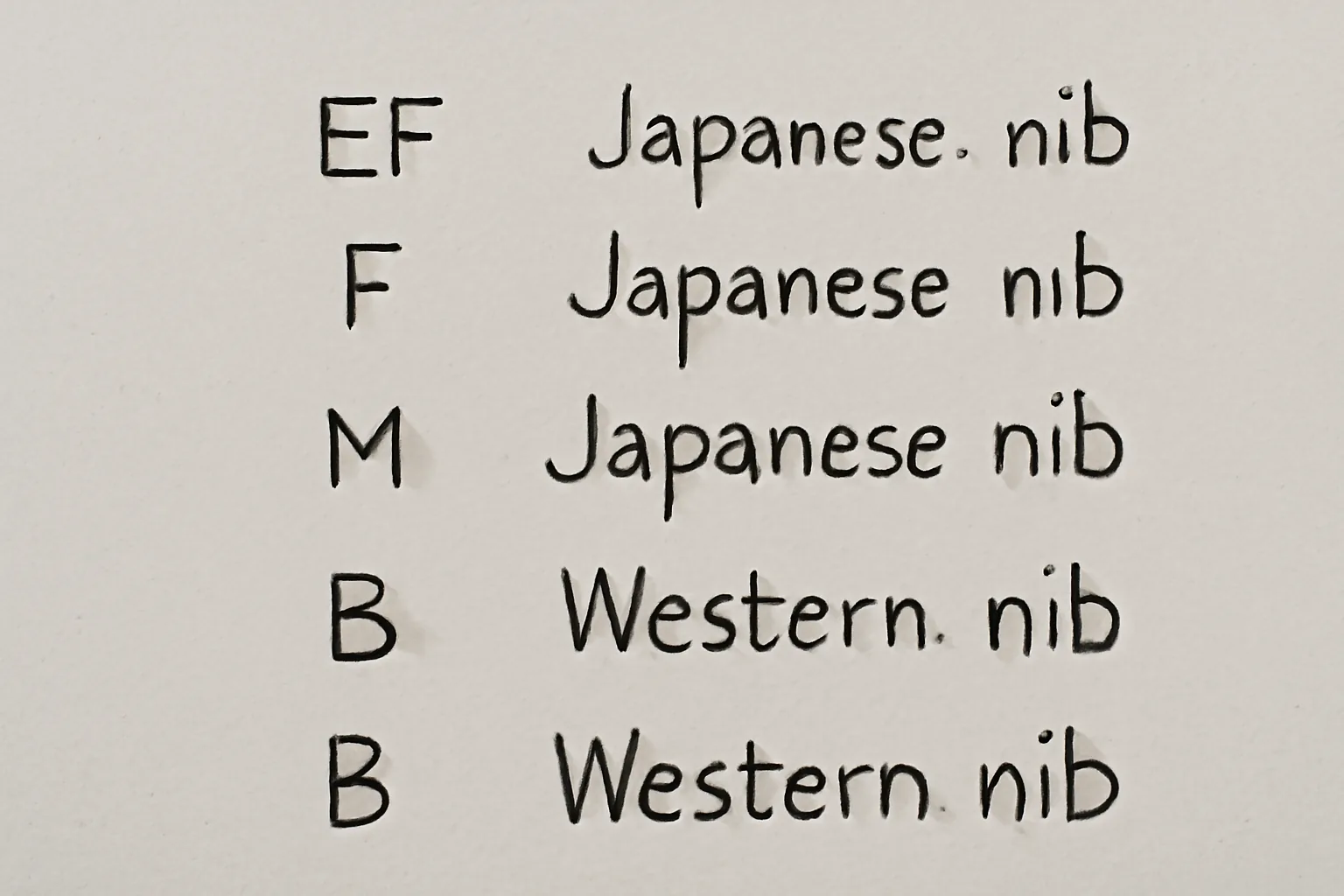
What I’ve found holds up pen after pen: shift one Japanese size and you land roughly on the equivalent Western size. A Japanese medium behaves like a Western fine. A Japanese fine behaves like a Western extra-fine. Carry that shortcut in your head every time you’re cross-shopping brands.
The Actual Line Widths, Measured Brand by Brand
Below are widths I measured myself, pen in hand, writing on Rhodia dot grid paper with Pilot Iroshizuku ink. Treat these as approximate — paper absorbency, ink viscosity, and how hard you press will all nudge the number slightly. Still, this gives you a real baseline no manufacturer chart bothers to provide.
- Pilot Metropolitan EF: approximately 0.3 mm
- Pilot Metropolitan M: approximately 0.5 mm
- Lamy Safari EF: approximately 0.4 mm
- Lamy Safari M: approximately 0.6 mm
- TWSBI Eco F: approximately 0.4 mm
- Pelikan M200 F: approximately 0.5 mm
- Sailor Pro Gear F: approximately 0.3 mm
Look closely and you’ll see Pelikan’s F sitting almost on top of Lamy’s M — which throws people every time. Same country, same general pen-making tradition, and yet Pelikan consistently runs narrower than Lamy. Even brands from the same region don’t agree with each other, which is exactly why telling a shop clerk “I’d like a medium” hands them almost no useful information.
The Paper Under Your Pen Matters More Than You’d Guess
I lost three weeks convinced my Sailor 1911 Large had shipped with a bad nib. Every line came out thick, feathery, soaked — nothing close to the crisp mark I expected from a Japanese extra-fine. The nib was never the issue. My notebook was. I’d been journaling on cheap, thirsty wood-pulp composition paper. The moment I switched to Tomoe River 52 gsm, that same nib wrote exactly the way it was supposed to. Absorbent paper pulls ink outward as it soaks in, and that spread can widen a line by 0.1 to 0.2 mm without the nib itself changing at all. Test any new pen on decent paper before you decide it’s defective.
Shape Matters as Much as the Width Number
Width is only half the story. How a nib is ground — its shape — changes the feel of writing sometimes more than the size label ever does. Four shapes come up again and again, and knowing them turns a guess into an actual decision.
Round nibs show up on nearly every pen you’ll handle. Turn the pen any direction and the line stays the same width. They’re the easy, forgiving choice — steady enough for daily journaling and note-taking, and it’s why most entry-level pens ship with one installed.
Stub nibs carry a flat, squared-off tip instead of a rounded one. That geometry gives you a wide stroke moving horizontally and a thin one moving vertically, which is where casual calligraphy gets its natural line variation from. Lamy sells a 1.1 mm stub as a drop-in replacement nib at no premium, and it changes the entire writing experience for the price of swapping a part.
Italic nibs share that flat profile but with a sharper, more defined edge. They ask for a steadier, more consistent pen angle than a stub does — reward a deliberate hand and punish a sloppy one. Anyone with under two years behind a fountain pen, I steer toward a stub first and an italic later.
Flex nibs spread their tines under downward pressure and throw dramatic variation into the line. Genuine vintage flex — nibs from pens made before the 1960s — doesn’t behave anything like a modern “semi-flex” grind, so don’t lump them together. Push a budget modern flex nib too hard and it’ll railroad, skipping ink entirely. Vintage flex asks for a light touch and consistent upkeep in return for that drama.
The Set That Made Nib Size Finally Click For Me
If cross-brand nib sizing has ever left you guessing, a multi-nib calligraphy set puts several widths in your hand at once so you can feel the difference rather than read about it. Rather than trusting what “medium” is supposed to mean at each company, lay an EF, F, M, and B side by side on the same page in one sitting and compare them directly.
Where it earns its keep
- With several widths in one box, you stop leaning on brand labels and start figuring out what line width and ink flow you actually prefer
- The nibs are sharp enough that the exact scratchiness my coffee shop friend complained about becomes obvious right away — you’ll feel which sizes and brands glide and which ones catch
- Working through a calligraphy-focused set forces you to slow your hand down and pay attention to nib behavior, which carries straight over into smarter pen choices for everyday journaling
Where it falls short
- Calligraphy nibs write noticeably broader than everyday fountain pens carrying the same size label, so treat this as a training tool rather than a substitute for your daily-carry pen
- Ink flow between the included nibs isn’t always even, so some of what you’re noticing is really ink behavior bleeding into your read on the nib itself
I’ll admit—my first hour with this set felt almost overwhelming, writing sample after sample and wondering if I was just adding more confusion to my pen drawer. Then something clicked: I held the EF and M nibs side by side, wrote the same sentence with each, and finally understood why your medium felt so different from mine. GC QUILL Calligraphy Fountain Pen Set (MU-09)
About This Article

Written by Ellen Ashford. Watch collector, fountain pen enthusiast, and lifelong journaler. Time & Ink is where I explore the craft of analog living — from vintage timepieces and fine stationery to the simple pleasure of putting pen to paper. More about this site.
Verify this against a primary source
Specifics change, and your situation may differ from the one described here. These are the authorities worth checking directly:
- NAWCC — horological reference, archives and research library
- Smithsonian Institution — collection records for historic timepieces and writing instruments