This post contains affiliate links. As an Amazon Associate, I earn from qualifying purchases at no extra cost to you.
If you’ve ever held a journal page up to the light and seen a ghostly shadow of yesterday’s entry bleeding through, you already know the frustration. Fountain pen ink ghosting show through is one of the most common complaints I hear from fellow journalers — and honestly, it tripped me up for years before I understood what was actually happening. There’s a real difference between ghosting and show-through, and conflating the two leads to bad ink choices, wasted money, and pages you can’t use on both sides.
I’ve been journaling with fountain pens for over fifteen years. In that time, I’ve filled more than 60 notebooks and tested well over 100 ink and paper combinations. My shelves hold everything from Leuchtturm1917 A5 hardcovers to Hobonichi Techo Weeks, and my ink drawer currently has 34 open bottles. I’ve made every mistake in this category. Now I want to save you the trouble.
This post breaks down what ghosting and show-through actually are, what causes each one, how paper weight and sizing affect the outcome, and which inks I’ve found perform best across the notebooks I use daily. By the end, you’ll be able to pick an ink and paper combination with real confidence.
What Is Fountain Pen Ink Ghosting vs. Show-Through?
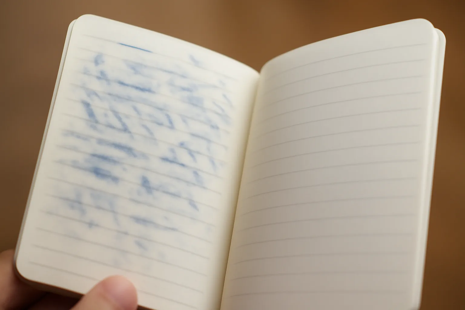
These two terms get used interchangeably online. They shouldn’t be. Ghosting means a faint impression of writing is visible on the reverse side of a page when light hits it at an angle — but it doesn’t interfere with writing on that side. Show-through is different. It means the ink has saturated the paper fibers so completely that the writing on one side is clearly legible from the other side, essentially making that reverse side unusable.
Think of it this way: ghosting is cosmetic. Show-through is functional. A mild ghost on a 90gsm Tomoe River page doesn’t bother me at all. Full show-through on a 80gsm Leuchtturm page means I’ve lost half my notebook capacity. That distinction shapes every ink and paper decision I make.
The root causes are different too. Ghosting typically happens when ink sits close to the surface of the paper and reflects light differently from an angle. Show-through happens when ink bleeds into the paper’s fiber matrix — often due to high dye concentration, saturated inks, or paper with low internal sizing. Understanding this helps you troubleshoot intelligently rather than just swapping inks randomly.
How Paper Weight and Sizing Affect Ink Behavior
Paper weight alone doesn’t tell the full story. I learned this the hard way with Tomoe River 52gsm paper. At first glance, 52gsm sounds terrifyingly thin. In practice, it’s one of the most fountain-pen-friendly papers ever made because of its exceptional internal sizing — a chemical treatment that reduces ink absorption into the fiber.
Internal sizing (typically done with alkyl ketene dimer, or AKD) creates a barrier that keeps ink sitting on or near the surface. Surface sizing adds a starch or gelatin coating on top. Both methods reduce feathering and show-through significantly. Notebooks marketed specifically for fountain pens — like Clairefontaine (90gsm, pH neutral), Rhodia (80gsm, cold-pressed), and Life Noble (80gsm, Japanese) — invest heavily in this process. Cheaper composition notebooks, by contrast, use minimal sizing, which is why your Pilot Metropolitan will bleed right through them.
In my experience, the minimum I’d recommend for two-sided fountain pen use is 80gsm with good sizing — or any Japanese-made paper specifically marketed for fountain pens. Below that threshold, ink behavior becomes unpredictable regardless of which ink you choose.
The Role of Ink Saturation and Dye Concentration
High-saturation inks are the beautiful troublemakers of the fountain pen world. Deeply pigmented inks — think Diamine Oxblood, Noodler’s Baystate Blue, or highly shading green inks — carry more dye per milliliter. That dye needs somewhere to go when it hits paper. On well-sized stock, it pools beautifully. On lesser paper, it migrates sideways and downward through the fibers.
Waterproof and pigment-based inks (like those using iron gall formulations) behave differently again. They bond with the paper fiber chemically rather than just sitting in it. That means they’re more resistant to ghosting in one sense — the ink stays put — but they can still show through on thin paper because the bond goes deep.
My Real-World Fountain Pen Ink Ghosting Show-Through Tests
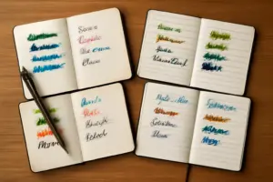
Over the past three years, I’ve run systematic tests across six notebooks and twelve inks. I write a 50-word paragraph, let it dry for 24 hours, then flip the page and evaluate ghosting and show-through under both natural light and a direct LED lamp. Here’s what I found in the combinations that surprised me most.
Rhodia No. 16 (80gsm) with Diamine Sherwood Green: significant ghosting, moderate show-through. The green’s high saturation pushed through even this well-regarded paper. Switching to a drier, lower-saturation ink on the same notebook — specifically PILOT Iroshizuku Take-Sumi — eliminated show-through entirely and reduced ghosting to a barely-there whisper.
Leuchtturm1917 (80gsm) with Waterman Mysterious Blue: minimal ghosting, no show-through. Leuchtturm’s paper is decent but not exceptional. However, Waterman’s inks are famously well-behaved — low saturation, moderate flow. That combination worked reliably. The same Leuchtturm notebook with Noodler’s Black showed moderate show-through because Noodler’s Black runs quite wet and saturated.
My first Hobonichi Techo Weeks (52gsm Tomoe River paper) with almost any ink: ghosting always, show-through almost never. That paper is a genuine marvel. I use it with everything now, including heavily saturated inks, because the sizing is extraordinary.
The Nib Width Factor You Might Be Ignoring
Here’s something most ink guides skip: nib width matters. A broad nib lays down 30-50% more ink per stroke than a fine nib. On the same paper with the same ink, my TWSBI Eco with a broad nib produced clear show-through on 80gsm Leuchtturm. My Pilot Custom 74 with a fine nib on the exact same paper: zero show-through, minimal ghosting.
If you’re determined to use wet, broad nibs in thinner notebooks, your ink choice becomes even more critical. You need the driest, lowest-saturation formulation you can find. That’s exactly where inks like Iroshizuku earn their reputation.
The Ink I Recommend: PILOT Iroshizuku Take-Sumi
I’ve used a lot of inks. Some are beautiful. Some are practical. The PILOT Iroshizuku Take-Sumi Bamboo Charcoal Black (50ml, Item 69224) is both — and it’s the ink I reach for when I genuinely need a notebook to hold up on both sides of the page.
Take-Sumi is a deep, slightly warm black with a subtle shading character. It reads as a clean, professional black in normal conditions but shows a hint of depth in good light. More importantly for this discussion: it is one of the best-behaved inks I’ve tested across every paper type. On Leuchtturm 80gsm, it produces zero show-through and only the faintest ghosting under a direct lamp. On Rhodia 80gsm, it’s essentially invisible from the reverse side.
I tested it in my TWSBI Eco (broad), my Pilot Custom 74 (fine), and a vintage Sheaffer Snorkel with a medium-wet nib. Across all three, Take-Sumi behaved impeccably. Dry time was 10-15 seconds on Rhodia — faster than most inks in my collection. The bottle design is also excellent: a wide, flat base that’s easy to fill from, with a deep well that lets you use close to all 50ml without tilting.
I’ve been through four bottles of Take-Sumi in the last two years. That tells you what I think of it. For journalers and daily writers who care about using both sides of the page, this is my first and strongest recommendation.
Runner-Up: PILOT Iroshizuku Shin-Kai (Deep Sea Blue-Black)
If you want color alongside excellent paper behavior, the PILOT Iroshizuku Shin-Kai Deep Sea Blue-Black (50ml, Item 69225) is my runner-up. It’s a sophisticated blue-black with cool undertones and gentle shading. Critically, it shares Take-Sumi’s low-saturation, well-behaved formula.
In my tests, Shin-Kai performed nearly identically to Take-Sumi on Leuchtturm and Rhodia paper. Show-through: none. Ghosting: minimal. Dry time was slightly longer — roughly 15-20 seconds on Rhodia — but still reasonable for daily writing. For anyone who writes in blue-black for professional documents or prefers color differentiation in their journaling system, Shin-Kai delivers the same reliability in a beautiful hue.
Both inks retail around $18-22 USD for a 50ml bottle, which puts them in the premium category. However, I typically use 8-12ml per filled notebook. That means one bottle lasts me 4-6 notebooks. The cost-per-use is genuinely reasonable once you do that math.
Practical Tips for Reducing Ghosting and Show-Through
Even with a great ink, technique matters. Here are the concrete adjustments I made that improved my results immediately.
- Write on a hard surface. Pressing down compresses paper fibers, pushing ink deeper. A firm writing board under your notebook reduces ink penetration measurably.
- Let ink dry fully before closing the notebook. Wet ink pressed against the facing page transfers dye and creates smearing that looks like show-through. Give it 30-60 seconds on slower papers.
- Switch to a finer nib for thin paper. A fine or extra-fine nib deposits significantly less ink per line. On Hobonichi Techo paper, I use nothing wider than medium.
- Avoid posting your pen while writing. It sounds counterintuitive, but posting (capping the barrel to the back of the pen) adds weight and changes writing angle, which can increase pressure and ink flow.
- Test inks on a loose sheet before committing to a new notebook. I keep a sample page from each notebook brand specifically for this purpose. Ten minutes of testing saves ruined notebooks.
When to Rethink Your Setup Entirely
Sometimes the issue isn’t solvable by ink selection alone. If you’re experiencing heavy show-through even with low-saturation inks on 80gsm paper, the problem is likely your notebook. Not all paper marketed at 80gsm is equal — cheaper brands often use lower-quality pulp with minimal sizing regardless of the stated weight.
In that case, I’d suggest switching to a notebook specifically certified or widely reviewed for fountain pen use. Clairefontaine notebooks (available for $8-15 USD depending on size) use 90gsm paper that I’ve never had show-through issues with — not once, across dozens of notebooks and over a hundred ink combinations. Rhodia is similarly reliable at the 80gsm range. Life Noble notebooks, made in Japan, are slightly harder to source but outstanding.
Also: if you’re using iron gall inks specifically, be aware they carry additional considerations. Long-term, iron gall formulations can weaken paper fiber due to their acidic pH (typically 2.5-3.5). For archival journaling, this matters. The ISO 9706 standard covers paper permanence for archival documents — worth understanding if longevity is a priority for you. For everyday journaling, standard dye-based inks like Iroshizuku carry no such risk.
Final Thoughts on Fountain Pen Ink Ghosting Show-Through
Fountain pen ink ghosting show-through comes down to three variables: ink saturation, paper sizing, and nib width. Control all three and you can use almost any notebook on both sides. Let one variable get out of hand and the reverse side becomes a write-off — literally.
My biggest lesson after fifteen years: don’t blame the ink until you’ve ruled out the paper. And don’t blame the paper until you’ve considered the nib. The whole system works together. Once you start thinking in systems rather than individual components, your results improve dramatically and fast.
For most journalers, the simplest answer is to start with PILOT Iroshizuku Take-Sumi in a quality notebook — Rhodia, Clairefontaine, or Tomoe River. That combination eliminates nearly every ghosting and show-through problem before it starts. Add a fine or medium nib, write with light pressure, and you will get clean, usable pages on both sides every time. That’s not a maybe. In my experience, across sixty-plus notebooks, it holds up reliably.