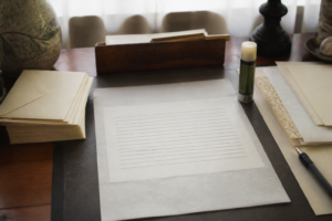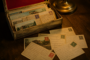
Turn a sheet of ecru stock up to the window and you can see it — that faint grid of fibers catching the light, the slight give when you press a nib against it. That’s what I’m doing right now, testing a stack of paper samples one at a time instead of writing the post I sat down to write. Digital messages don’t survive that kind of scrutiny. An email gets archived and forgotten; a text scrolls off the screen within the hour. A letter written on decent paper stays put on someone’s desk, gets picked up a second time, gets felt for its weight and its tooth and the way ink sits into it rather than just printed onto it. My interest in letter writing comes from the same place as my interest in mechanical watches: an object made with some care, used with some intention, says something a digital stand-in never quite manages.
Most people’s error is treating their stationery as an afterthought rather than a decision. They reach for whichever cream-ish paper is closest at hand, stuff it into whatever envelope happens to match roughly, and then can’t figure out why the finished letter feels flat. What I’ve found, after doing this for a while, is that a genuinely cohesive set doesn’t just look nicer — it changes how you write. You slow down. You take more care with the actual composition. And that shift comes through on the other end; a recipient registers the difference before they’ve read a single line.
Ten years, give or take, of running fountain pens against paper — everything from a $12 Platinum Preppy up to a vintage Pelikan 400NN — and pairing them against stock ranging from bargain-bin copier paper to 100gsm Clairefontaine. That stretch of trial and error is where I learned what actually earns a stationery set a permanent spot in rotation, versus what gets used three times and quietly donated. Here’s what that testing taught me.
Why Paper Weight and Surface Texture Determine Everything
Weight is the number I check first, before anything else. For letters, the sweet range is 90gsm to 120gsm. Go below 80gsm and fountain pen ink bleeds straight through — I found that out the hard way when a letter written in Diamine Oxblood soaked clean through a 75gsm sheet, ruining the back side and mortifying me in front of a pen pal I’d only just met at a stationery fair. Push above 120gsm, on the other hand, and the sheet starts behaving like card stock — it folds differently and tends to crack right along the envelope seams.
Texture carries just as much weight as the gsm number, if not more. A smooth, hot-pressed finish suits wet nibs — italics, stub grinds — that need somewhere to lay down ink evenly. A cold-pressed sheet with a little tooth gives you feedback, that resistance fountain pen writers actually like, and it keeps broader nibs feeling controlled rather than slippery. Ecru, in particular, tends to come finished with a semi-smooth surface that lands right in that middle zone — it plays well with medium nibs, broad nibs, even a plain ballpoint, without ever feeling slick or clinical.
The tone of ecru is worth a separate mention. Bright white paper has a way of making even good handwriting look sterile. Ecru — that warm, faintly creamy off-white — softens whatever ink you’re using and flatters it. A deep blue-black like Pilot Iroshizuku Tsuki-yo reads richer on ecru than it ever does on stark white, and sepia inks pick up extra warmth from it too. The paper is doing optical work before the pen even makes contact.
The Role of Writing Lines in Letter Writing
For years I avoided lined stationery on principle, convinced blank paper simply looked more refined. That was inexperience talking, not good judgment. Blank sheets look elegant in the abstract, but in practice, even a careful writer starts drifting off the horizontal by the third paragraph. The lines you can’t see start sloping anyway. Spacing goes uneven. By the second page, the letter reads as rushed no matter how unhurried you actually were writing it.
Printed lines fix this without costing you any elegance — as long as they’re subtle about it. Good lined stationery uses a faint gray or pale gold rule, something that guides the eye instead of competing with the ink sitting on top of it. Lines set 7mm to 8mm apart suit most adult handwriting with a medium nib. Tighter spacing, closer to 5mm, works better for fine or extra-fine nibs and smaller script. But if you’re writing with something like a 1.1mm stub or a broad italic, you’ll want the full 8mm to 9mm of breathing room.
Printed margins get overlooked constantly, but they matter. A left margin around 1.25 inches gives the page real structure and leaves space for a recipient to jot notes in the margin — a small thing, but one that a pen pal who takes correspondence seriously will notice and appreciate. It’s a tiny detail that signals you were thinking about their reading experience, not only your own enjoyment writing it.
Matching Envelopes and Why Presentation Is Half the Message
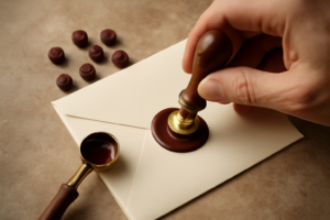
The most common mistake I run into, even among people who otherwise put real thought into a letter, is the mismatched envelope. Someone chooses gorgeous heavy stock, composes a considered letter in a beautiful ink, then drops it in a plain white #10 envelope pulled from a box of 500. But the envelope is the first thing a recipient actually sees. If it contradicts what’s inside, the whole presentation falls apart before the letter is even opened.
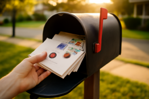
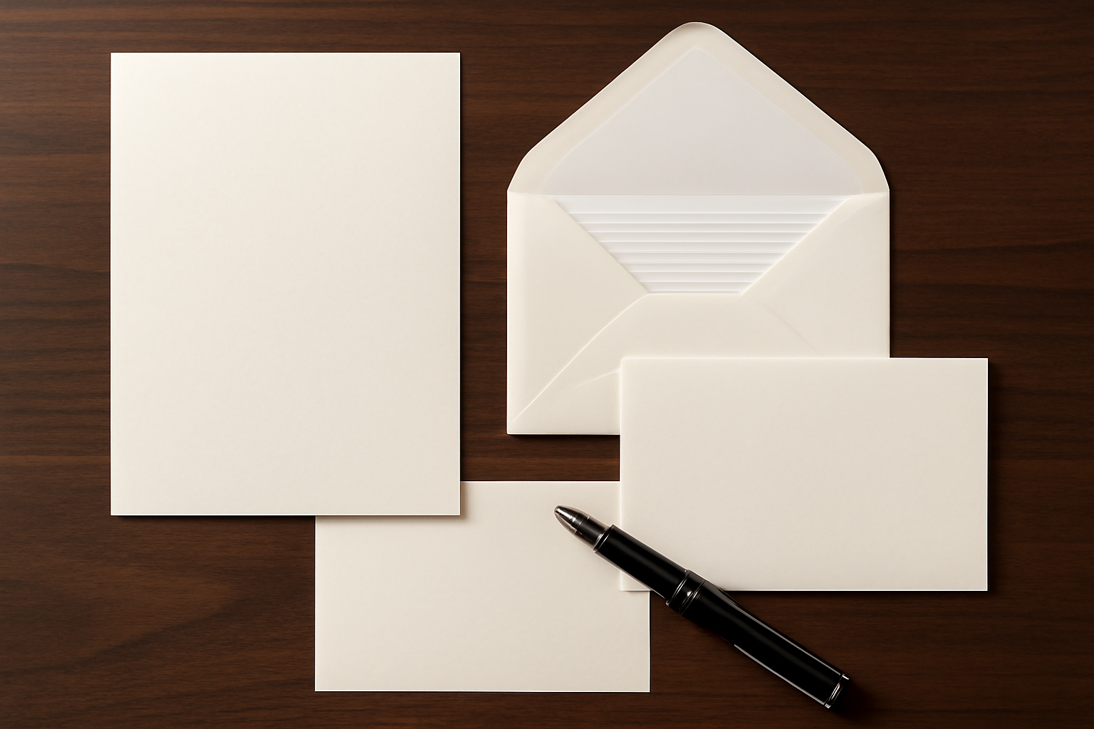
A properly matched set — paper and envelope cut from the same stock, sharing the same visual design — sidesteps this entirely. The envelope stops being packaging and becomes part of the letter itself. When the color and border detail carry through from envelope to page, the whole object reads as considered the moment it lands in someone’s mailbox. That matters especially with a first letter to someone new — first impressions in correspondence work exactly the way they do face to face.
Proportions matter on a practical level too. A standard sheet folded in thirds needs to slide into a #10 or DL envelope without forcing the fold. An 8.5×11 sheet folds cleanly into thirds for a standard envelope, provided that envelope is actually sized to match. And if you’ve ever watched a stiff 100gsm sheet split a flimsy envelope flap at the seam, you already know envelope weight matters just as much as paper weight. Look for envelope stock rated at 90gsm or higher if you want folded pages held cleanly without strain.
The Stationery Set That Finally Made Recipients Reply in Kind
Truth is, nobody writes back to a letter that feels like an obligation. A mismatched set reads as an afterthought; a cohesive one reads as intentional. This particular set is the one that closed the gap between “that was a nice gesture” and “I’m actually keeping this.”
What works
- The gold border picks up light in a way that reads as deliberate — recipients clock it before they’ve even broken the seal.
- Matching envelopes mean addresses aren’t scrawled onto some random spare sheet — it signals care and turns the whole exchange into something worth answering in kind.
- The paper’s weight and texture genuinely slow your hand down while writing, which shows up on the page as something worth a recipient’s time.
What doesn’t
- That formal gold border doesn’t flex well for a casual note to a close friend — it comes across a touch overdressed for a quick hello.
- Once it becomes your set, it’s hard to go back — you end up locked into one aesthetic instead of rotating through others.
I hesitated ordering this—worried it might feel pretentious, or that I’d get fancy stationery and still not actually send letters. Then the first recipient told me they’d kept mine on their nightstand. XXINMOH 90 Piece Stationery Set – 60 Vintage-Style Paper
About This Article

Written by Ellen Ashford. Watch collector, fountain pen enthusiast, and lifelong journaler. Time & Ink is where I explore the craft of analog living — from vintage timepieces and fine stationery to the simple pleasure of putting pen to paper. More about this site.
Verify this against a primary source
Specifics change, and your situation may differ from the one described here. These are the authorities worth checking directly:
- NAWCC — horological reference, archives and research library
- Smithsonian Institution — collection records for historic timepieces and writing instruments