A few years ago, I handed my Pilot Metropolitan to a friend across a coffee shop table. She picked it up, wrote three words, and frowned. “It feels scratchy,” she said. “Mine writes so much smoother.” Her pen? A Lamy Safari with a labeled medium nib. Mine? Also labeled medium. That moment is exactly why fountain pen nib sizes compared across different brands is one of the most confusing topics for new writers — and even for seasoned collectors. The label on the nib means almost nothing without knowing the brand behind it.
I’ve been collecting fountain pens for over twelve years. I’ve inked up Sailors, Pilot Customs, vintage Pelikans, and a drawer full of entry-level calligraphy sets. What I’ve learned is this: nib sizing is not a universal standard. There is no ISO regulation, no ASTM code, no shared industry specification that forces a Japanese “fine” to match a German “fine.” Manufacturers set their own tolerances, and those tolerances vary wildly. Understanding why that happens will save you money, frustration, and a lot of wasted ink.
Why Nib Size Labels Are Misleading by Design
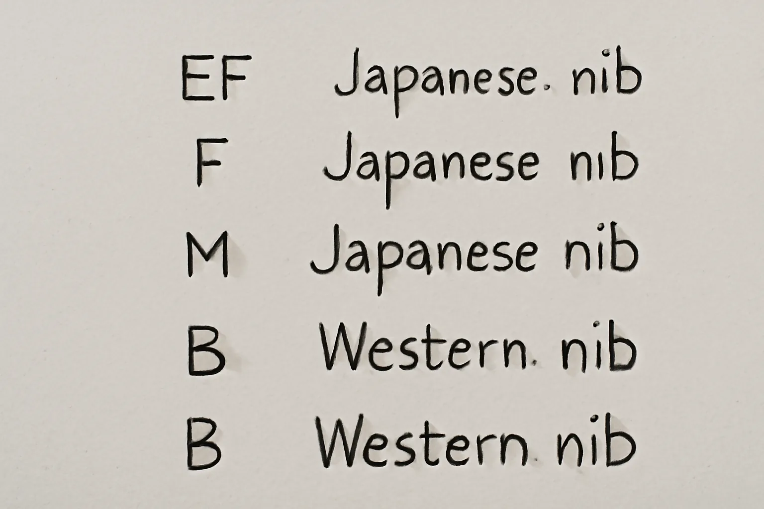
Here’s something the pen industry rarely advertises openly: nib size designations — EF, F, M, B — describe a manufacturer’s internal range, not an absolute line width. A Pilot EF nib typically lays down a line roughly 0.3 mm wide. A German brand like Lamy labels their medium at approximately 0.6 mm. That’s a full 0.3 mm difference between an “extra fine” and a “medium” from two different makers. On paper, that gap is enormous.
The reason comes down to manufacturing tradition and target markets. Japanese pen makers historically catered to writers using kanji and kana characters. Those scripts demand precision. Tight strokes, fine details, small characters — all of that requires a narrower nib. German and Italian manufacturers traditionally served a Western cursive market. Wider, wetter, more expressive lines suit that style of writing perfectly. As a result, each tradition built its own internal scale.
In my experience, this rule holds remarkably consistently: one Japanese size equals roughly one Western size up. A Japanese medium writes like a Western fine. A Japanese fine writes like a Western extra-fine. Keep that mental shortcut ready whenever you’re shopping across brands.
Fountain Pen Nib Sizes Compared: The Real Numbers
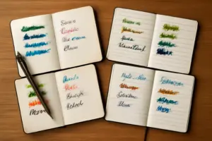
Let me give you actual line widths from pens I’ve personally tested on Rhodia dot grid paper using Pilot Iroshizuku ink. These numbers are approximate — paper absorbency, ink viscosity, and writing pressure all shift the result slightly. However, they give you a working baseline that no chart in a catalog will.
- Pilot Metropolitan EF: approximately 0.3 mm
- Pilot Metropolitan M: approximately 0.5 mm
- Lamy Safari EF: approximately 0.4 mm
- Lamy Safari M: approximately 0.6 mm
- TWSBI Eco F: approximately 0.4 mm
- Pelikan M200 F: approximately 0.5 mm
- Sailor Pro Gear F: approximately 0.3 mm
Notice how the Pelikan F and the Lamy M land at nearly the same width? That surprises most people. Both are German manufacturers, but Pelikan runs narrower than Lamy across the board. Even within the same national tradition, individual brands diverge. This is exactly why “I want a medium” isn’t enough information when you’re buying a new pen.
Paper Type Changes Everything
Here’s what I learned the hard way: I spent three weeks convinced my new Sailor 1911 Large had a defective nib. Lines looked thick, feathery, and wet — nothing like the crisp strokes I expected from a Japanese extra-fine. The pen was fine. My paper wasn’t. I was journaling on cheap composition notebooks with highly absorbent wood-pulp paper. When I switched to Tomoe River 52 gsm paper, the same nib performed exactly as advertised. Fountain pen ink soaks into absorbent paper and spreads, effectively widening any nib by 0.1 to 0.2 mm. Always test a new pen on quality paper before drawing conclusions.
Understanding Nib Shapes Beyond Width
Width is only part of the equation. Nib shape dramatically affects the writing experience — sometimes more than the size designation does. There are four shapes you’ll encounter most often, and knowing them helps you buy with intention rather than guesswork.
Round nibs are the most common. They write the same line width regardless of angle or direction. These suit everyday journaling and note-taking. Most entry-level fountain pens ship with round nibs. They’re forgiving, consistent, and easy to control for new writers.
Stub nibs have a flat, rectangular tip. They produce a wider horizontal stroke and a narrower vertical one. That variation creates natural line variation — the hallmark of expressive handwriting and casual calligraphy. A 1.1 mm stub from Lamy costs nothing extra as an add-on nib and transforms the writing experience completely.
Italic nibs are similar to stubs but with crisper, sharper edges. They demand more consistent pen angle. Specifically, italics reward deliberate, practiced writers. They punish sloppy grip. I always recommend stubs before italics for anyone under two years of fountain pen experience.
Flex nibs respond to downward pressure by spreading the tines and creating dramatic line variation. True vintage flex nibs — from pens made before the 1960s — behave differently from modern “semi-flex” nibs. Don’t conflate the two. Modern flex nibs on budget pens often rail-road (skip ink) under heavy pressure. Vintage flex nibs require a delicate touch and proper maintenance.
The Best Way to Explore Nib Sizes Without Breaking the Budget
This is where I tell new enthusiasts the same thing every time: don’t buy one pen in one size and decide what you like. Buy a set with multiple nibs and experiment. The cost of getting it wrong on a $30 pen is annoying. Getting it wrong on a $150 pen stings considerably more.
Last spring, a reader reached out after spending $80 on a single calligraphy pen she hated. She’d chosen a broad italic without ever writing with a stub first. The pen wasn’t wrong for her — she just needed a smaller italic to start. That story is why I now recommend the GC QUILL Calligraphy Fountain Pen Set (MU-09) as the ideal starting point for anyone serious about understanding nib variety.
The set includes seven pens, each loaded with a different nib. You get genuine variety in a single purchase — not one pen with interchangeable tips, but seven distinct writing instruments. It also ships with 40 ink cartridges, which is enough to actually use the pens rather than baby them. I put this set in front of three different beginner calligraphers over the past year. All three identified their preferred nib style within a single afternoon of writing. That kind of direct comparison is worth far more than reading ten blog posts (including this one).
A Budget-Friendly Runner-Up Worth Knowing
If the GC QUILL set is unavailable or you want a second option, I’ve also tested the Lanxivi Yongsheng Calligraphy Fountain Pen Set. It offers six assorted tip sizes in a transparent clear body, which lets you watch the ink feed — genuinely useful when you’re learning about flow and saturation. The body feels lighter and less substantial than the GC QUILL. However, for art drawing, practice lettering, and signature work, it performs capably and costs slightly less. Consider it if you want a transparent demonstrator-style pen for ink visibility.
How to Match Nib Size to Your Writing Purpose
Different tasks genuinely call for different nibs. This isn’t preference — it’s function. Here’s how I break it down after years of pairing pens to purposes.
- Daily journaling on standard paper: Japanese F or EF. Keeps writing compact and legible on normal ruled lines without feathering.
- Note-taking in meetings: Japanese M or Western F. Fast, smooth, readable — wide enough to write quickly without losing control.
- Calligraphy practice and lettering: Stub 1.1 mm or Italic 1.5 mm. Line variation is the whole point. Round nibs will frustrate you here.
- Signatures: Western M or B. Bold, expressive, visible on documents. A thin signature looks tentative. A broad one reads as confident.
- Sketching and art: Flexible or multiple nibs in sequence. Fine for detail lines, broader for fills and shading.
One practical note on ink: thicker, wetter inks amplify nib width. Noodler’s Baystate Blue runs wet and will make any nib behave larger than its label suggests. Pilot Iroshizuku inks run on the drier side and actually tighten perceived line width slightly. Controlling both variables — nib size and ink behavior — gives you far more precision than chasing nib swaps alone.
When to Ask an Expert or Send Your Pen In
Most nib issues are user-fixable. Scratchy writing? The tines may be misaligned or the tip needs smoothing with a micromesh pad. Too dry? Gently increase flow by adjusting the feed. Too wet and blobby? Clean the pen, check the ink, and reduce feed pressure. These adjustments take 15 to 30 minutes and cost almost nothing.
That said, some situations call for a professional nibmeister. If your nib has a visible crack in the tine, stop using it immediately. A cracked tine will not self-correct and risks permanent damage to the feed. Prices for professional nib work range from about $20 for basic smoothing to $75 or more for full nib reshaping and adjustment. Nibmeisters like Mike Masuyama or Mark Bacas have waiting lists — plan accordingly if your pen is valuable.
Also, if you’re tempted to adjust a vintage nib yourself and the pen is worth more than $200, send it to a professional. I once bent a 1940s Vacumatic nib trying to fix a slight scratch myself. The repair cost me $65 and three weeks without the pen. My DIY attempt saved nothing. Know the limits of your tools and your confidence before you start.
Final Thoughts on Fountain Pen Nib Sizes Compared
The single most important thing I want you to take away from this post: nib size labels are brand-specific, not universal. When you’re comparing fountain pen nib sizes across different manufacturers, you need actual line width data — not just the letter on the nib. A Japanese EF and a German M can write nearly identical lines. A Japanese M and a German M can look completely different side by side.
Start with a multi-nib set if you’re new to this. Test on quality paper. Match your nib shape to your actual writing purpose — not just to what looks impressive in a pen store. And don’t spend serious money on a single luxury pen until you know exactly which size and shape suits your hand.
Twelve years of collecting has taught me that the right nib feels invisible when you write. You stop noticing the pen and start noticing your words. That’s the whole point of analog writing — and it’s worth taking the time to find your fit.
This post contains affiliate links. As an Amazon Associate, I earn from qualifying purchases at no extra cost to you.